

Designing Business Postcards With PrimoPrint!
BLK AND NOIR on 13th Jul 2020
I was offered a $150 credit + free design services to experiment with business cards with a designer. I had ordered from Primoprint previously, so I was so excited when they came to me with this proposition!

(previous card by PrimoPrint)
My round corner square business cards for my jewelry brand are all over Pinterest as brand inspiration for others, needless to say, they were a very big hit!

I often write jewelry guides as a quick, informal, and comprehensive ways to care for jewelry or to learn about different metals and stones. My focus is on more affordable but long-lasting jewelry. Some of our pieces are simple everyday pieces and some are meant to pass on as heirlooms or gifts to someone you genuinely care about. I also guide people on lesser-known metals that usually don't have guides or get much attention like say “ the metal process of Rhodium.”
Normally I print my own care cards as an addition to my business cards but I jumped at the opportunity to create these! I wanted to design cards that were functional, something customers would save for further use, whether that was with our jewelry or just their everyday jewelry pieces.
The Design Process
First I was sent a sample pack of their design choices such as paper, finishes, elaborate features like foil, and spot UV. Then the unimaginable happened, the coronavirus pandemic shut down everything and the project went on hiatus. Of course, I would have this incredible project during a pandemic! The process was a bit difficult because we were always in the cross between my studio being closed, their facilities opening then closing then opening again, and different segments of the design process being controlled by the global pandemic. I bet on a normal timeline, this would have taken a week or so, but with everything going on, it took two months!
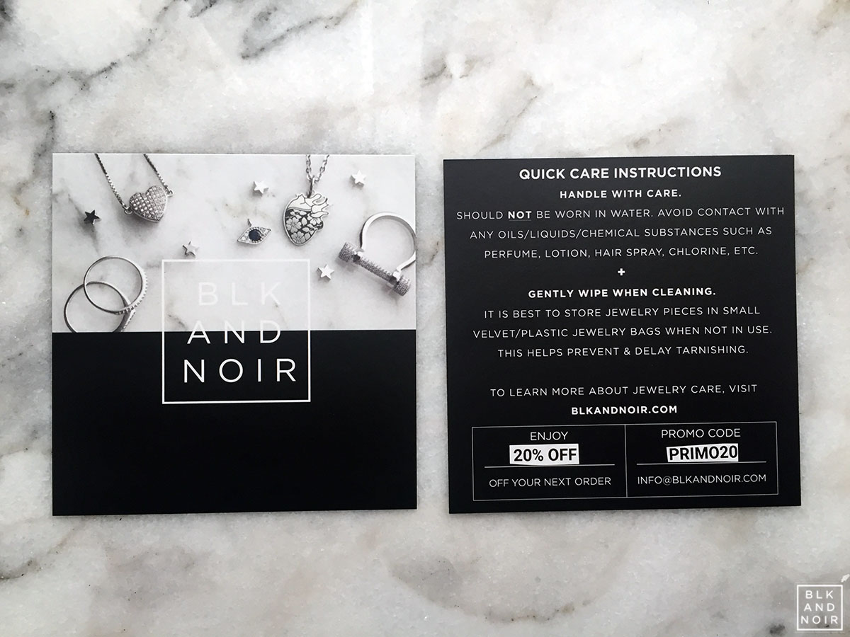
Once everything was partially available I was set up with the designer, Brooke. Brooke was very patient and willing to come up with many ideas off of the inspiration photos I presented her. I hope I didn’t drive her too crazy with my pickiness. I had various designs to choose from; nonetheless, I wanted the design to be something creative and different. In addition to functionality, I wanted something that showed off our pieces so that people would be interested or at least say “ WOW! I want to see what else they have!”
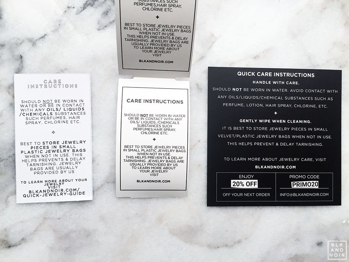
(The evolution of the care instruction cards 2015, 2018,2020)
I then forwarded them all of my best photographs but I soon realized I needed to step up my game because this is print! I'm so accustomed to producing photography just for web and not for print, I had to rethink everything such as lighting and the layout for the card. Furthermore, I had to consider how the colors would be translated to CMYK format (which is what they print in). CMYK in print is usually darker and slightly different than what you see on your computer screen, which is usually RGB. Of course in Photoshop, you have the option but getting it to translate on a basic printer (I ditched my CMYK printer years ago) is challenging. In the end, I retook over 200 high-resolution photos with my DSLR in one afternoon to get the perfect shot to fit the lighting and layout.
I selected:
- 4 x 4-inch postcards
- Silk Laminated finish
- 16 PT paper
I would say the biggest hurdle for me was trying not to control everything. I come from a photography background and I am accustomed to Adobe Photoshop to make my business cards or asking my graphic designer friend for assistance. I regret not learning the Adobe Suite, ha! When Brooke would come with a design, I constantly wanted to alter it myself and see if I could adjust it to my liking so I wouldn't have to keep asking for proofs. I suppose that could be an issue for someone like me who can be picky.
Eventually, we decided on 4 x 4-inch postcards. Square cards aren't very standard; most people go with 4x6 inch postcards. Our previous cards were 2.5 x 2.5 square size and people just love them! So I didn't want something typical and forgettable which is why I chose this style. I initially went all out with the bells and whistles of rounded corners and foil but it did become costly with a card of that shape and size. Looking back I would recommend being more mindful and planning ahead.
Honest Opinion
 (right click + open image in new tab to see it closer)
I finally received my cards, which took about a week after I ordered them. There was a little issue but the studio fixed it immediately and did a reprint.
The Size
Remember I mentioned the size? Well…I measured the size before selected it and wow, they are huge. It's a bit jarring even though it is smaller than a standard 4x6. Nonetheless, I think with this size and uniqueness, customers are more likely to keep it around even just for the novelty.
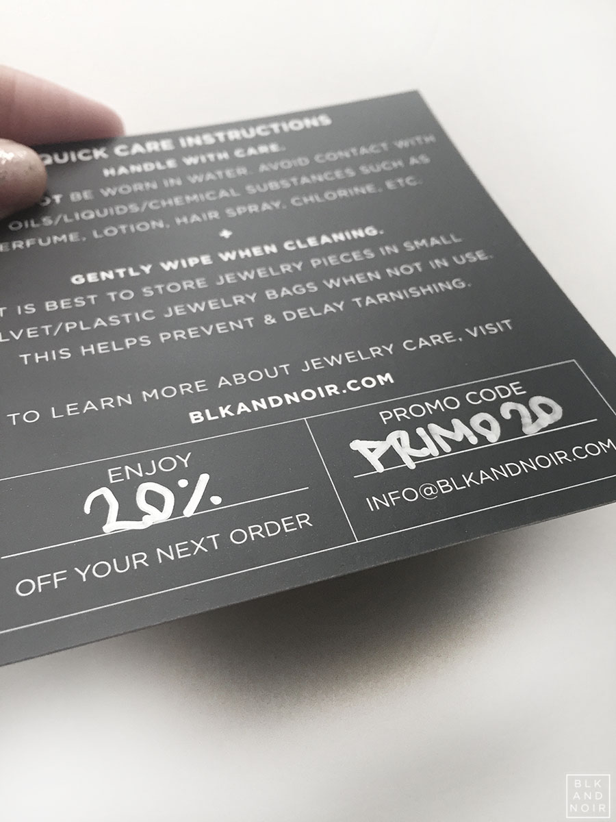
The Finish
The cards were very sleek and smooth, which makes them stand out from other services. I planned to write in coupon codes with a silver gel pen but I didn't take into account the silk finish. The correct finish was “uncoated” to avoid smearing, so I had to get creative. I gave myself three options I had at my disposal.
My Choices:
- A Sharpie in metallic silver (The
winner!
Sort of. Initially, this was a disaster, I wrote on
the card and it smeared. I panicked! But I later discovered with this kind
of paper I have to let it dry. So far it seems permanent. This initially
wasn’t going to be my first choice as metallic Sharpies only come in what
they consider “fine point”. I don’t consider it fine point and makes it
harder to write larger coupon codes.)
- Brothers Label Maker labels (I tried this one with my P-Touch, I wish they had metallic silver, but I have gold on clear labels but our cards are pretty much all silver jewelry.)
- Dymo 450 Label Maker (The winner! Sort of. I have thousands of labels just sitting around. The great thing about this choice is I could make any code I want and mass produce them easily. The only downside is they only come on white paper with black writing. See above photograph.)
I think I will give #1 and #3 a try and see how customers respond.
Recommendations:
- - If you want the bells and whistles, you should go for it but plan! Unfortunately, I decided not to get the foil and rounded corners because of pricing and I think they would have fit my cards much better especially on the photograph and block idea.
- - If your design is difficult you should consider getting their designers and have it planned to take into account of all cost, you don't want to get to the end and get sticker shock.
- - The designers are designers, not your grammar police or spell checker, so I would be careful to look over your information repeatedly. Bring in a second or third person to inspect. After you do something after so many hours, everything starts to look the same, so it helps to have multiple sets of eyes.
Finally,I would recommend PrimoPrint because they offer unique products compared to the many different design services I've used. If you want something fancy and unique but with consistent quality, they are a good choice.
#howiprimo #primoprint